“Clarity, strength, and style — all in one font: Alecrim.”
A grotesque with no expiration date.
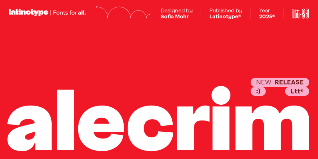
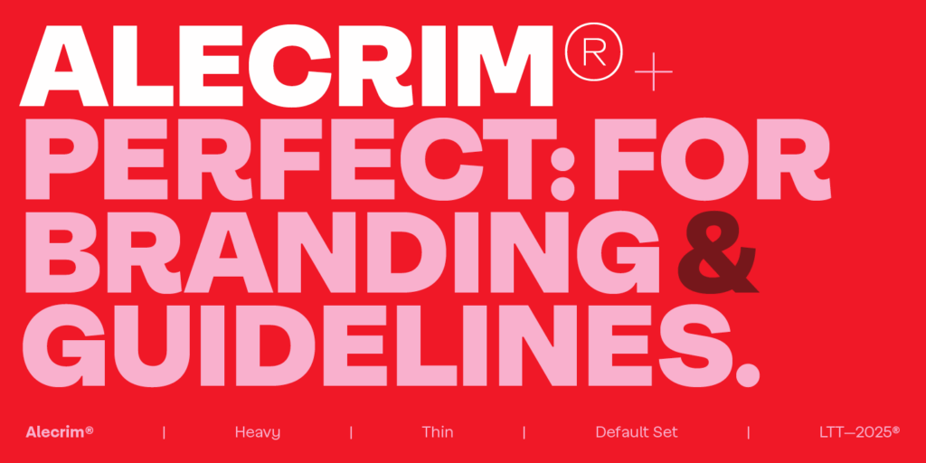
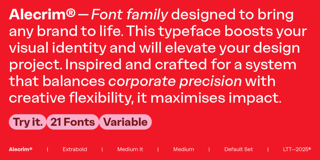
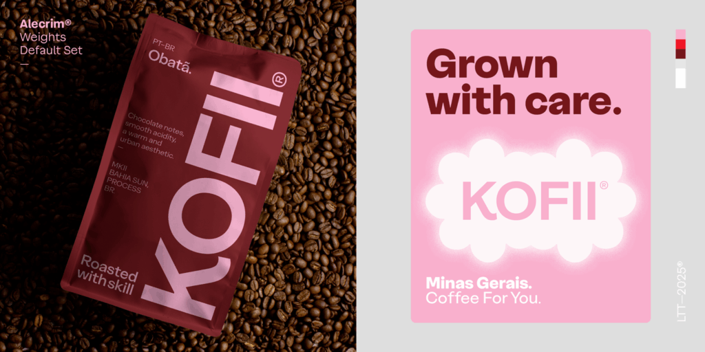
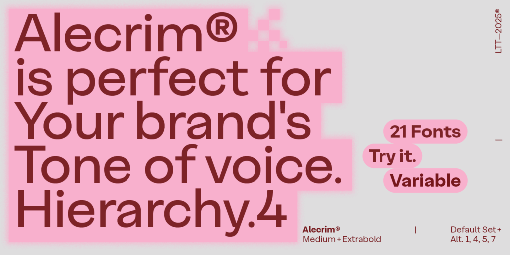
Alecrim is a sans grotesque typeface with firm strokes, generous height, and precise construction. Crisp in small sizes and striking in headlines, it blends functionality with a clear, contemporary visual voice. Its structure avoids unnecessary ornaments, maintaining a sober rhythm that resists trends and stylistic excesses.
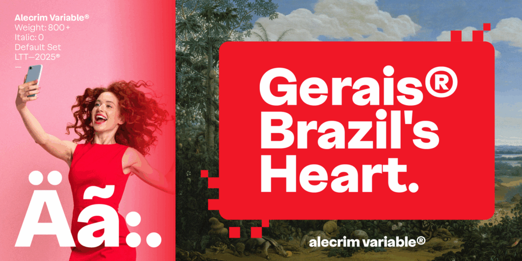
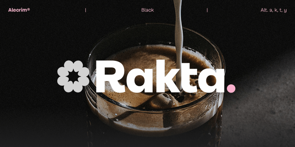
The set includes 10 weights —from Ultra Thin to Black— plus italics, for a total of 20 styles also designed as a variable font. The text variants are optimized for readability, while the alternate sets enhance its expressiveness in display use. Taut curves, closed terminals, and low contrast give the text unique character and rhythm.
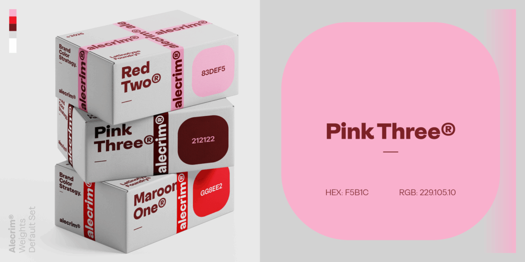
Inspired by 20th‑century grotesques, Alecrim aligns with timeless sans serif classics such as Helvetica, Frutiger, and Franklin Gothic. Its contemporary precision and graphic solidity make it a reliable tool for visual identity, editorial design, and systems that demand clarity, neutrality, and durability.
