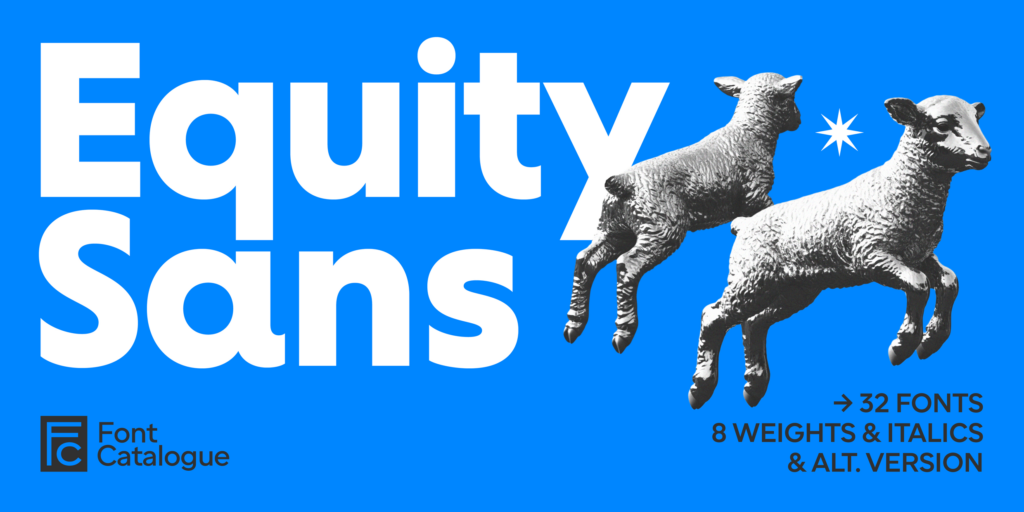
 Equity Sans
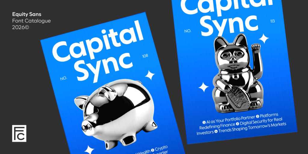
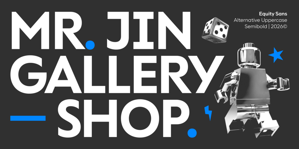
“Soft geometry, sharp presence.”
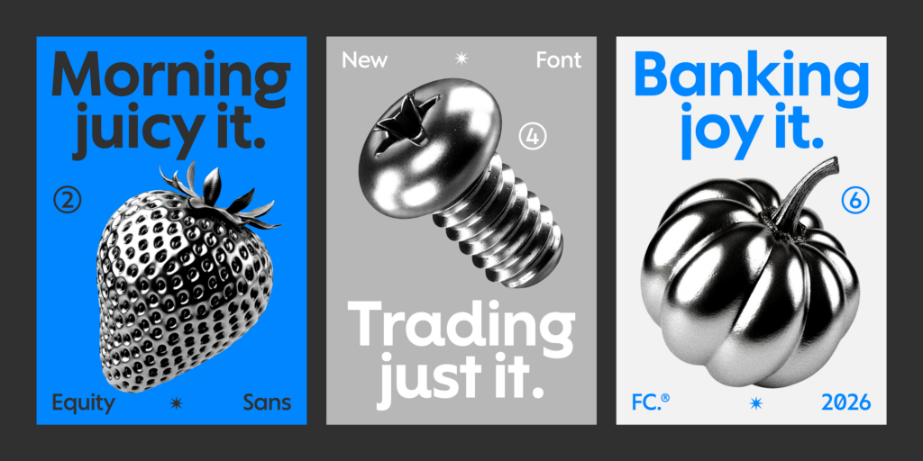
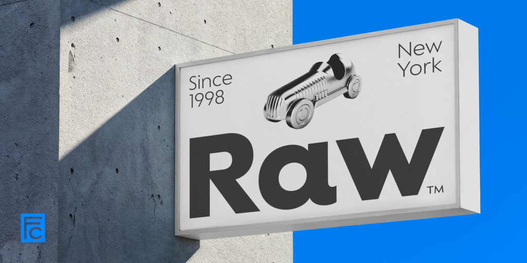
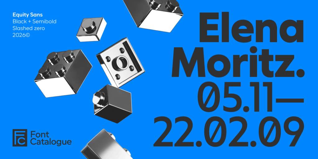
Equity Sans is a geometric sans with a rounded soul—literally. Built on pure circular forms, this typeface blends the crispness of modern design with a softness that feels remarkably approachable. It’s typography shaped by form, but guided by emotion. With rounded terminals, generous curves and open rhythm, it’s an ideal fit for brands that want to express warmth, care or well-being.
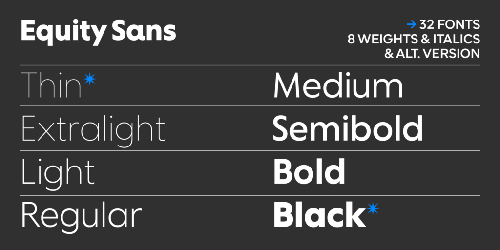
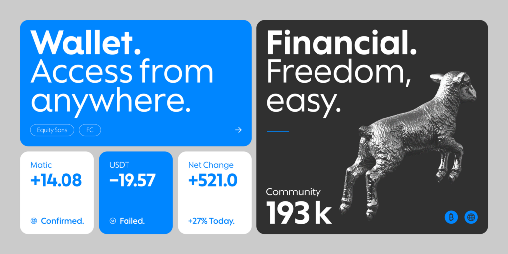
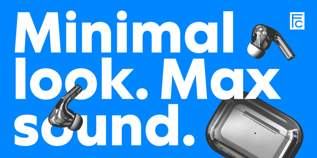
From beauty products to lifestyle packaging, Equity Sans feels contemporary, clean and accessible. Yet it never loses structure—its eight weights and eight italics give it the flexibility to perform across complex systems, from logos and landing pages to editorial campaigns. It doesn’t shout, but it doesn’t go unnoticed either. Equity Sans has presence without aggression, and character without rigidity.