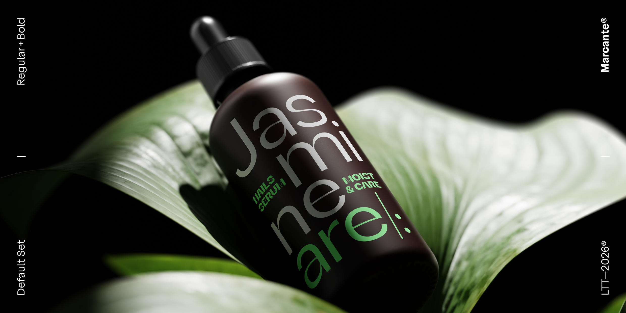
Designed to catch the eye and stay in the memory
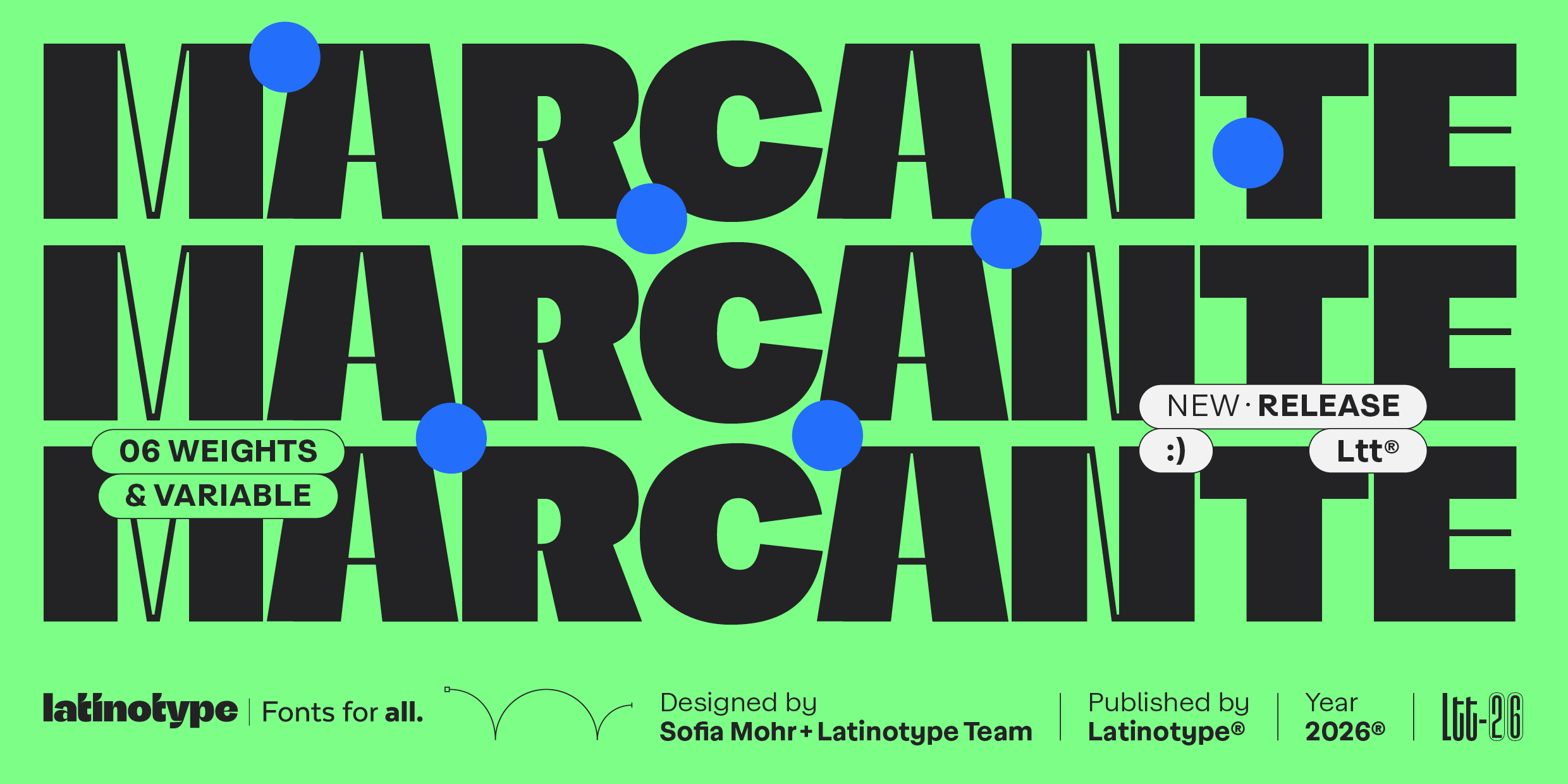
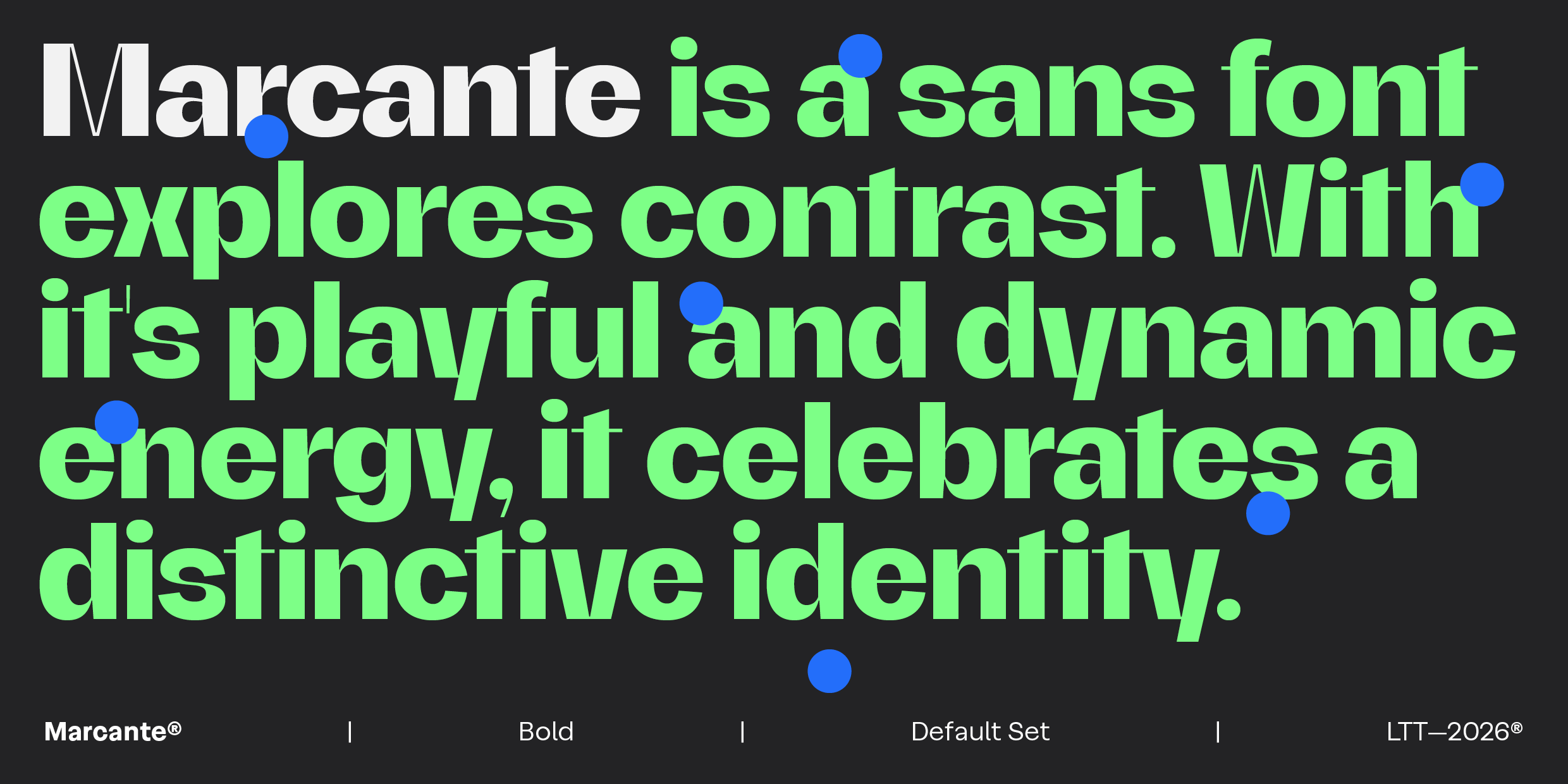
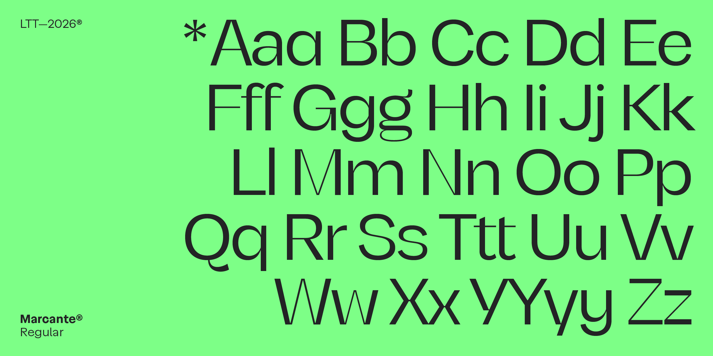
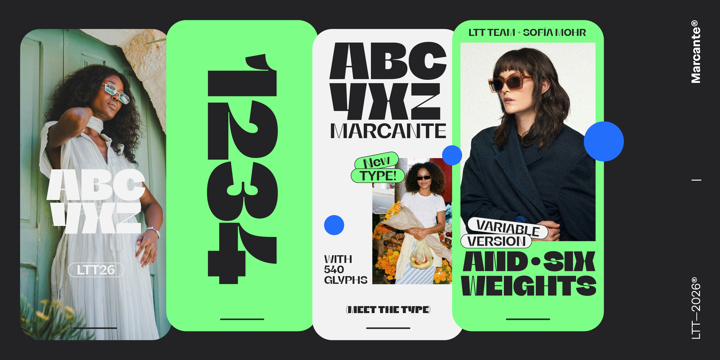
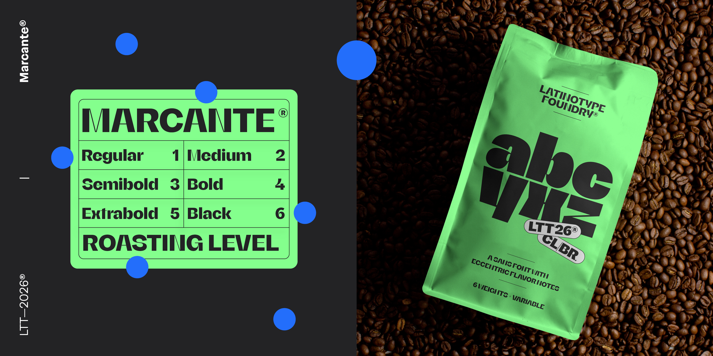
Marcante is a display typeface designed to stand out from the first glance. Its name — kept in Portuguese — precisely expresses its essence: to be impactful, striking, and memorable. From its Regular weight, the family asserts a clear presence: it does not seek neutrality, but character.
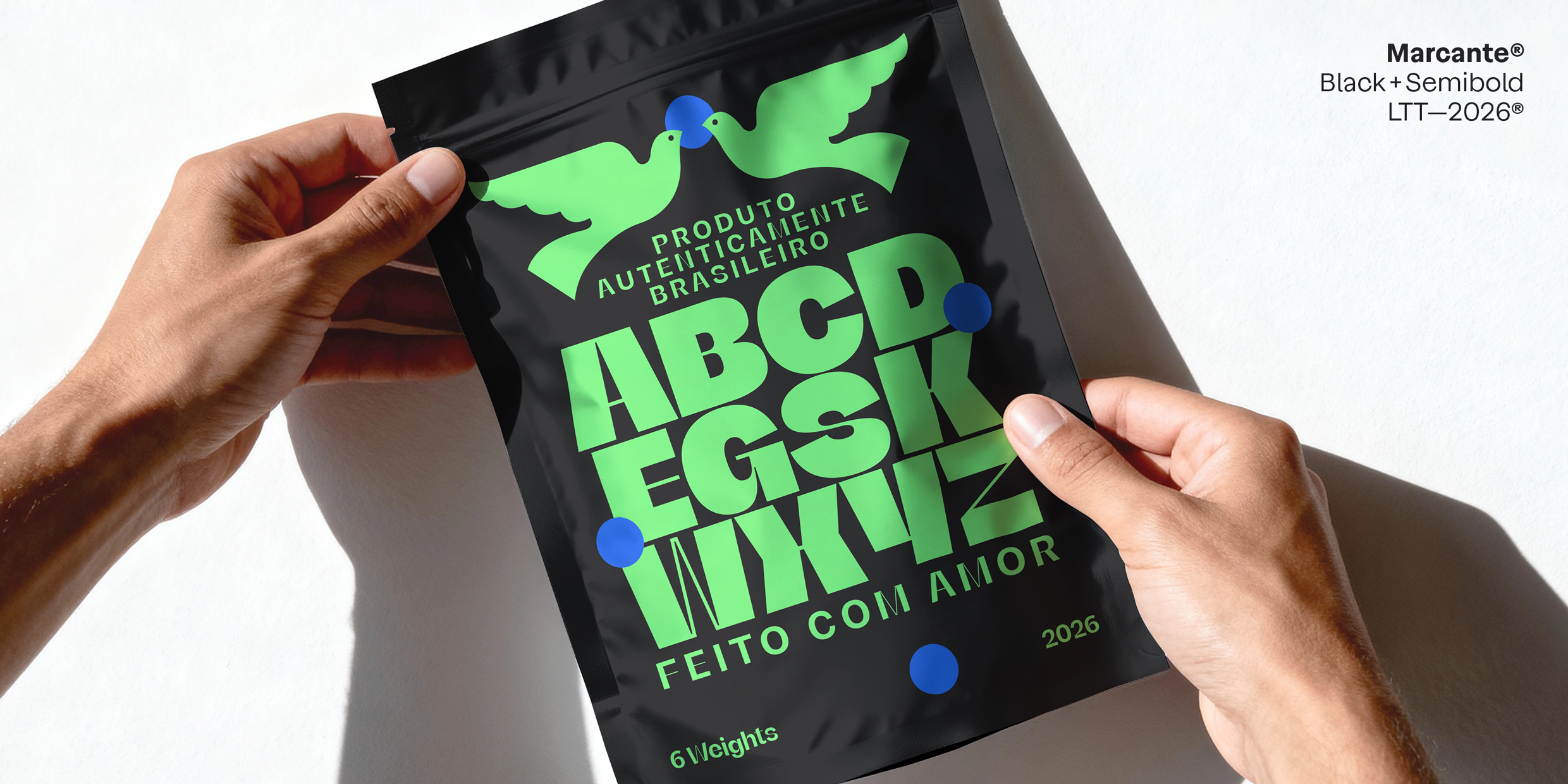
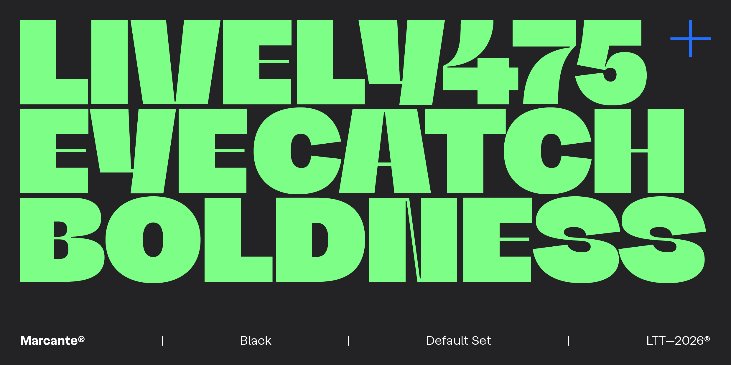
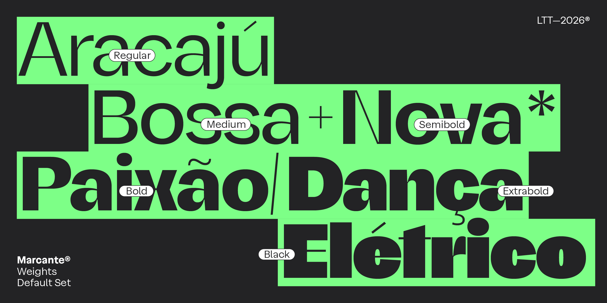
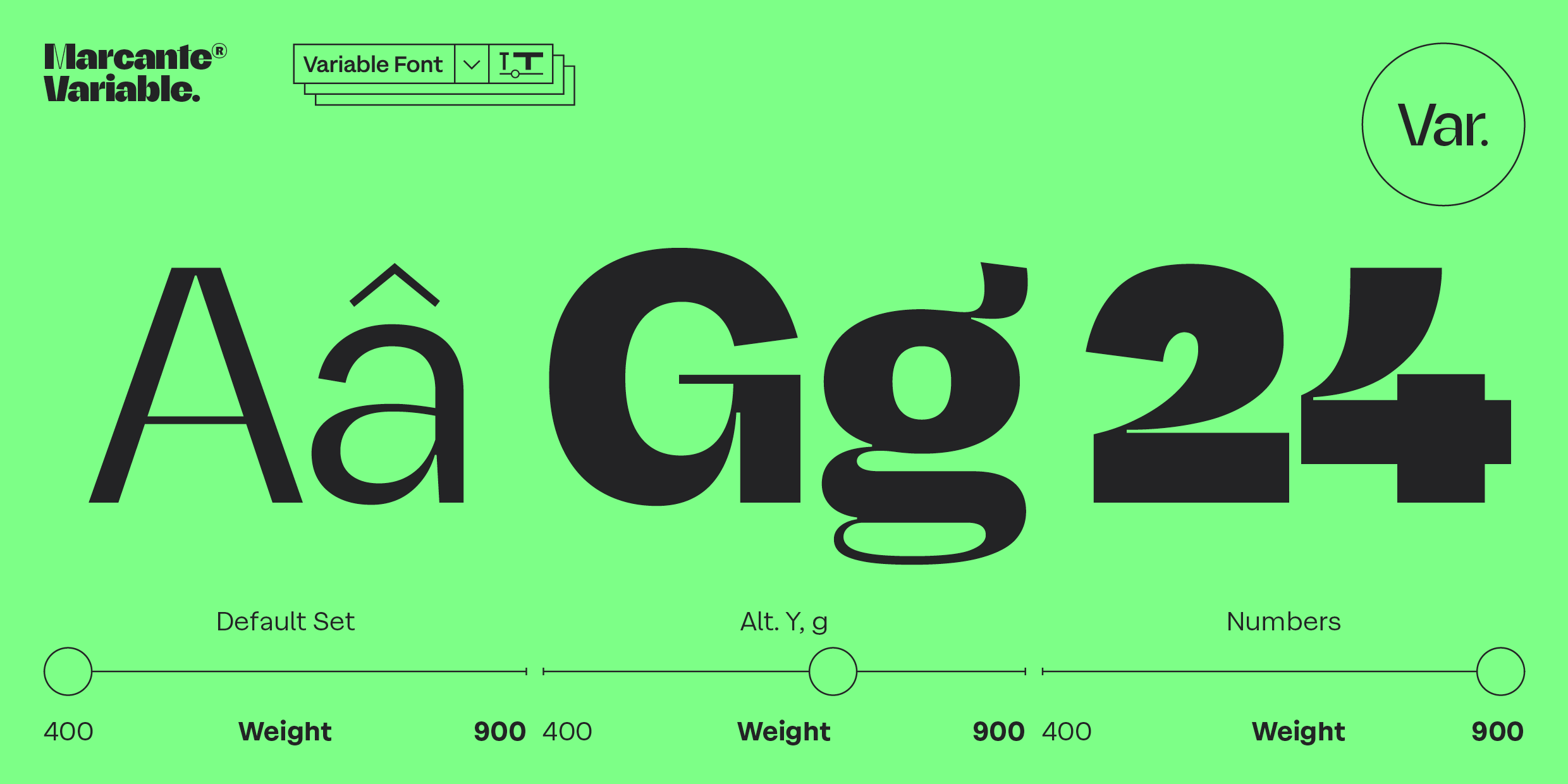
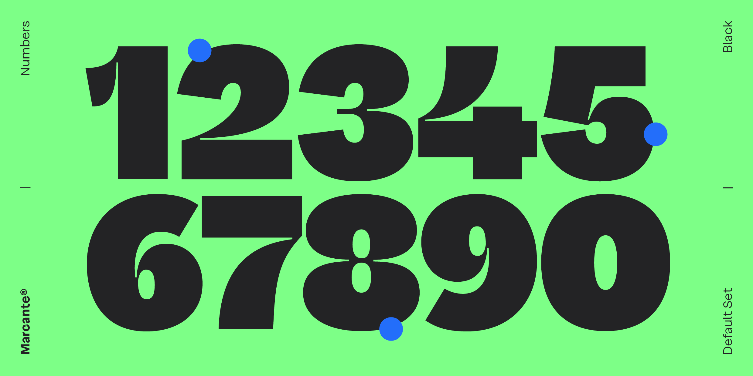
With six weights ranging from Regular to Black, plus a Variable font, Marcante offers an expressive range always oriented toward visual presence. Each weight intensifies its voice, evolving toward denser and more forceful variants designed for headlines that demand immediate attention.
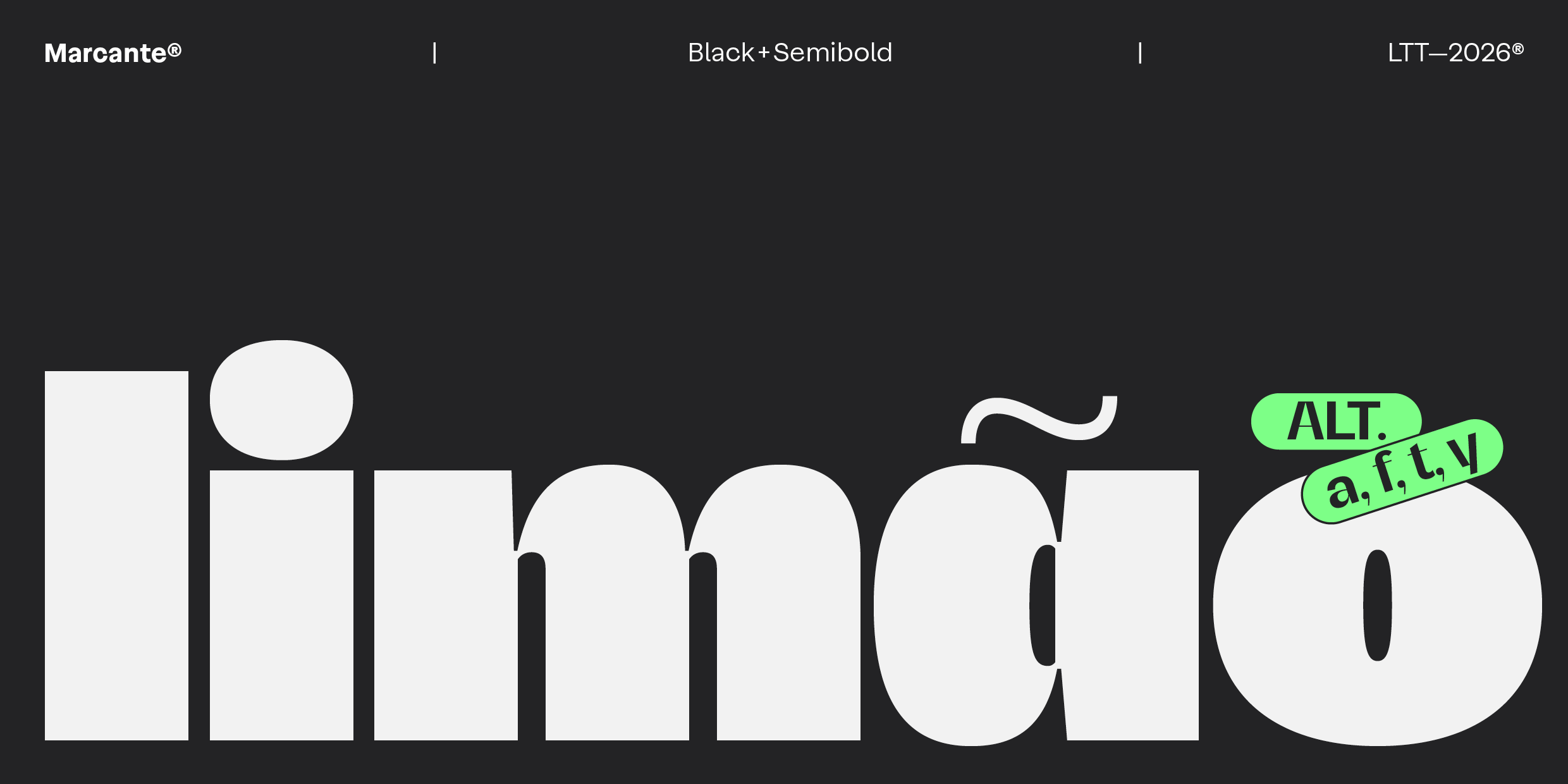
Its construction combines the solidity of a neo-grotesque with the precision of a geometric. The contrast between wide curves and straight strokes generates rhythm and tension while defining a strong and recognizable identity.
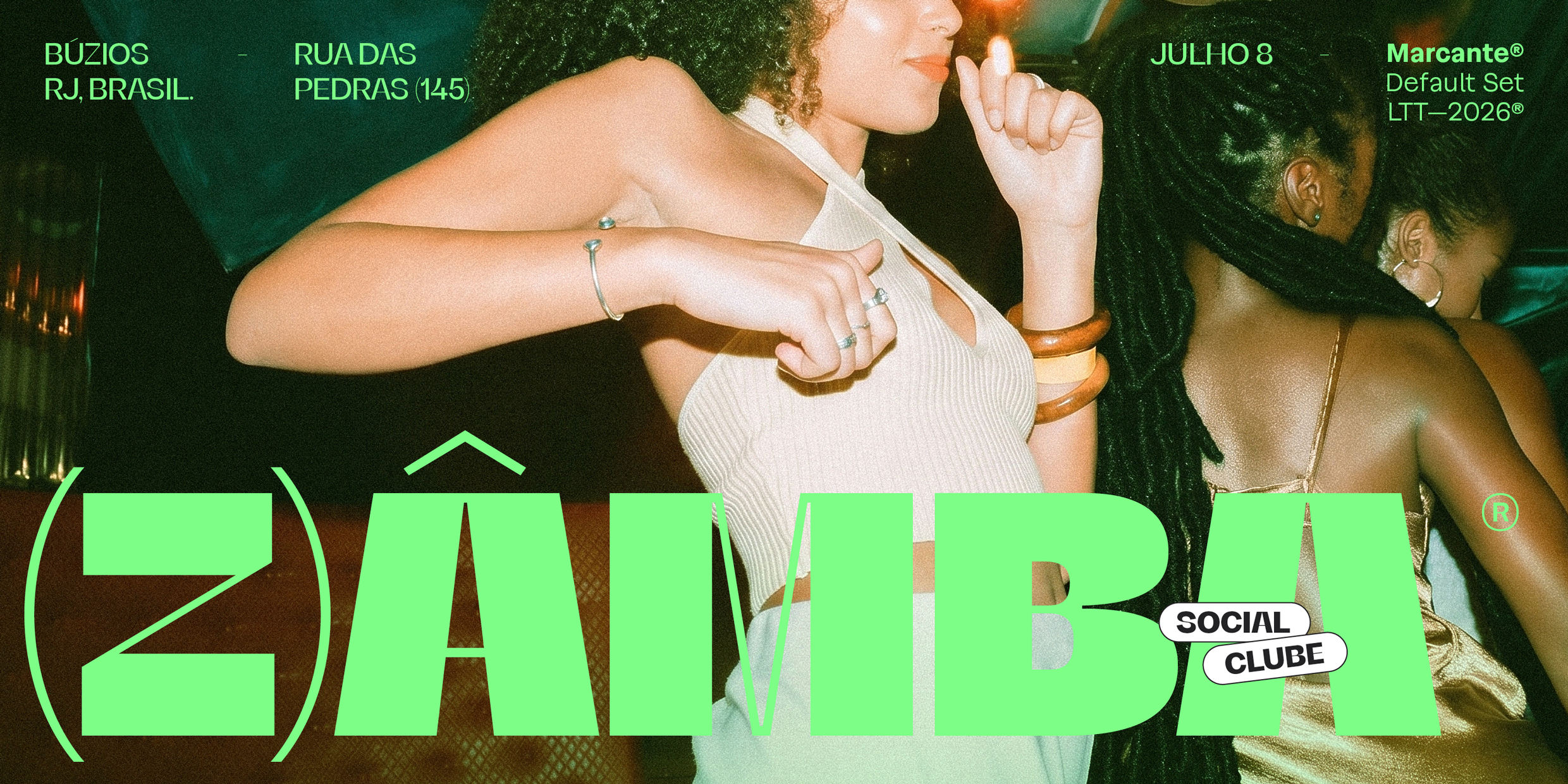
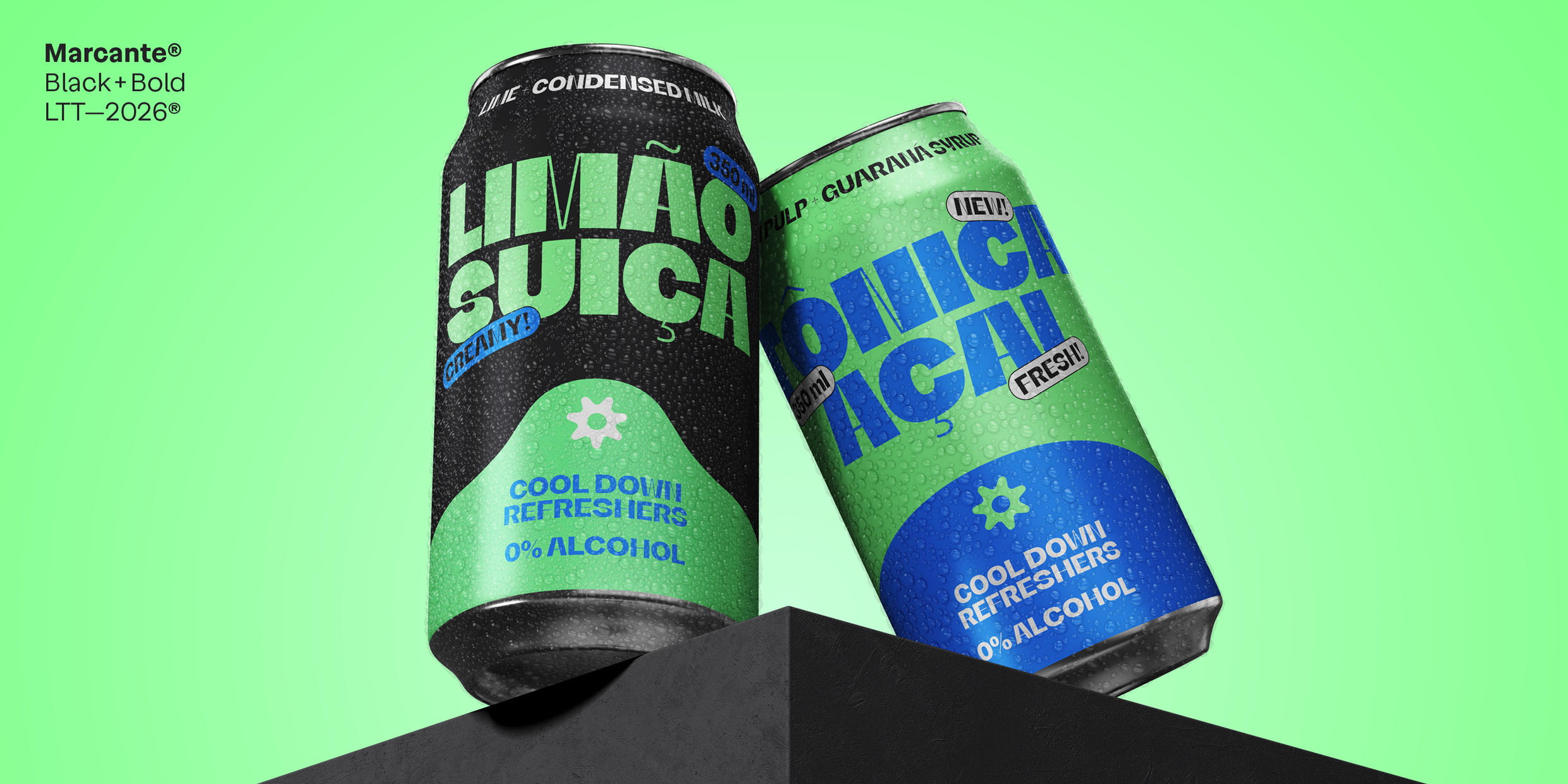
That intensity is amplified in its visual language. Marcante deploys in high-impact compositions where typography occupies the center: extreme scales, repetitions, overlaps, and cuts build graphic blocks that organize space and capture attention.
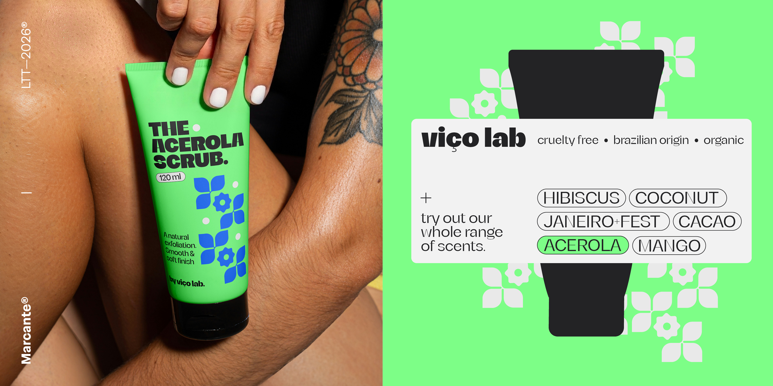
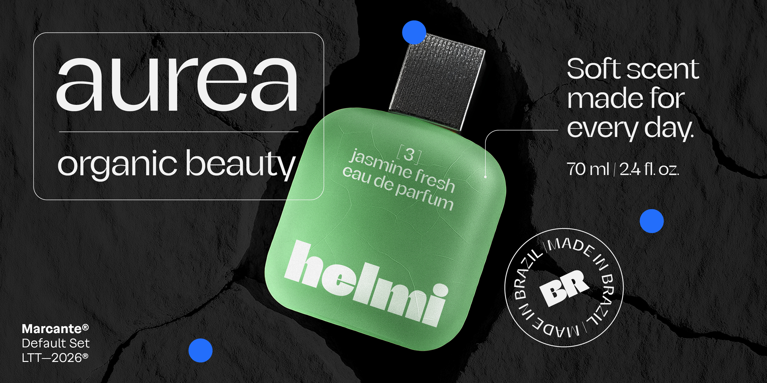
A versatile tool for branding, editorial, and contemporary visual systems that seek to stand out with clarity and character.
Designed to catch the eye and stay in the memory.