“Meeting. Space, rhythm, and presence.”
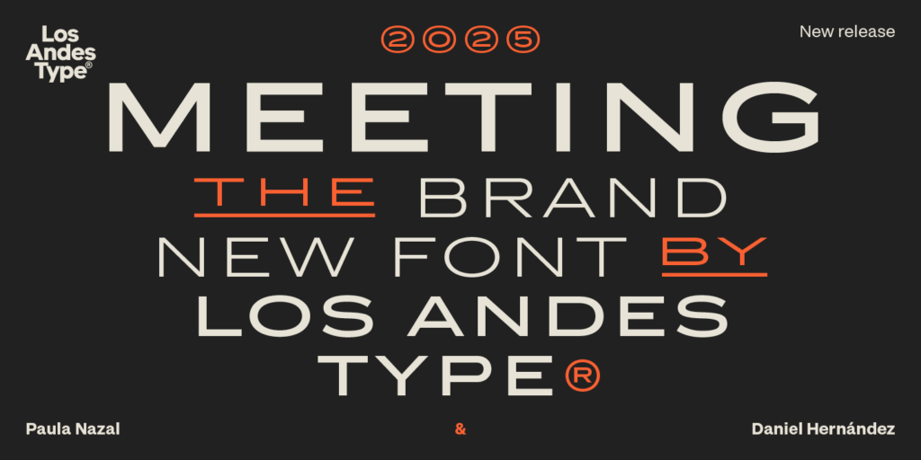
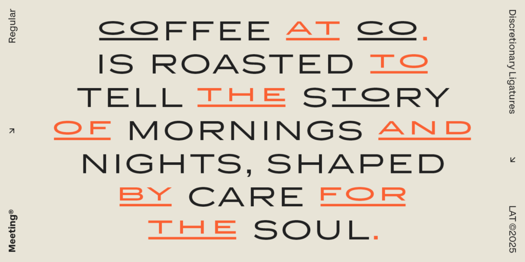
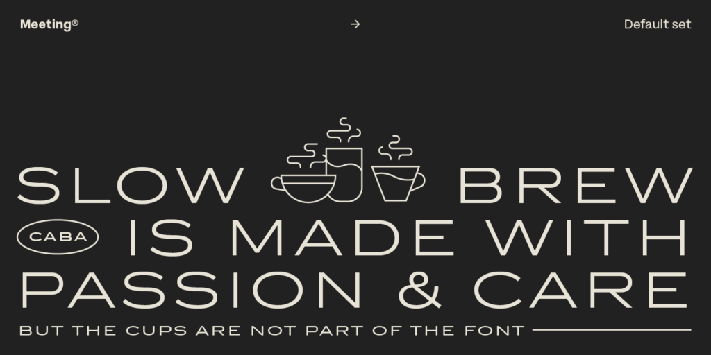
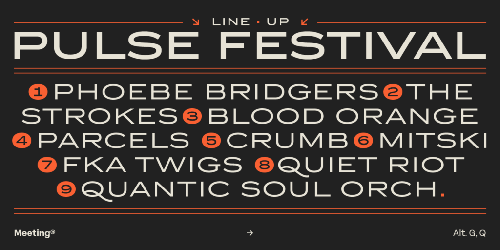
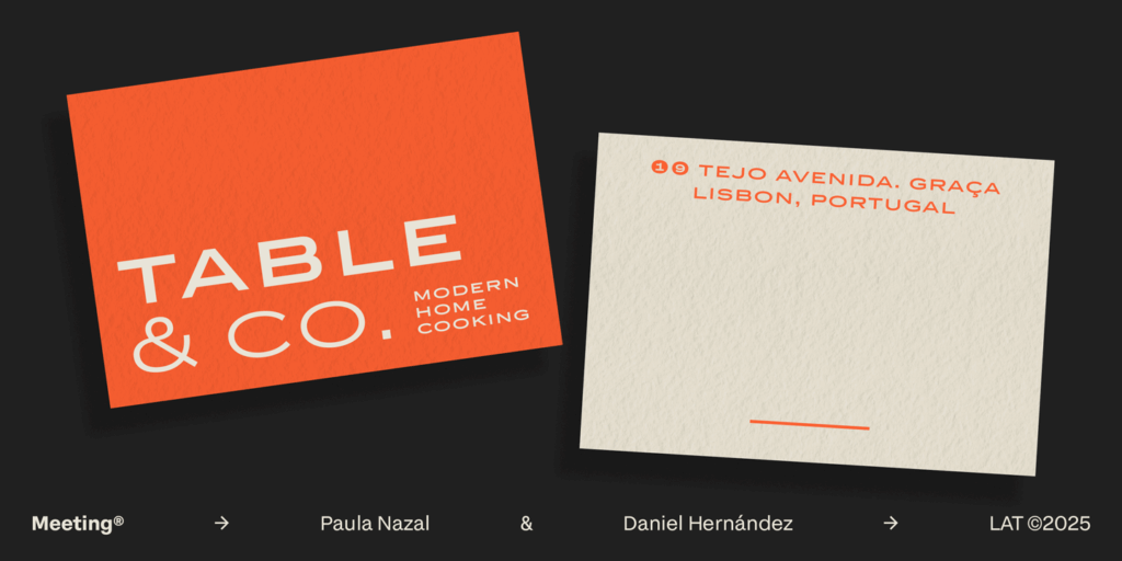
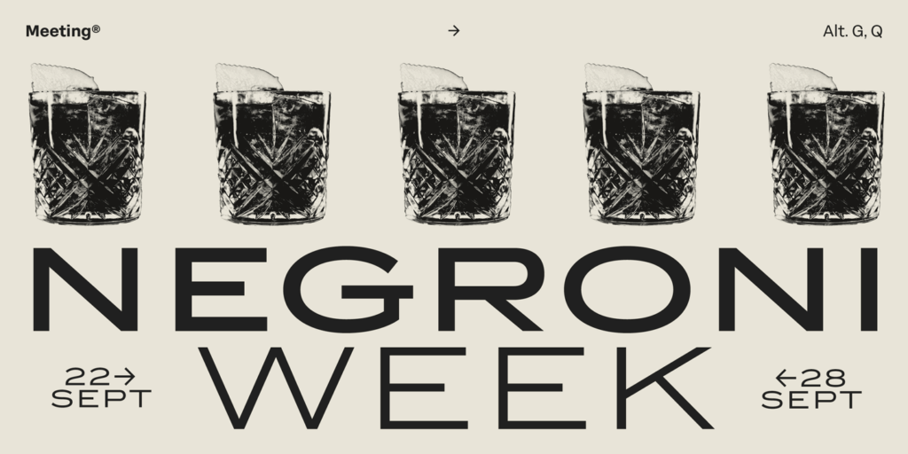
Meeting is a sans serif with wide capitals and firm proportions. It carries a contained elegance and a contemporary feel, inspired by the sobriety of Copperplate Gothic, reinterpreting its spirit with a more relaxed and modern approach. Its generous spacing gives each word room to breathe, achieving clear reading and balanced composition.
Built from solid shapes and clean strokes, its curves are precise, its cuts defined, and its structure holds a visual weight that conveys confidence. Its design embraces the value of pause.
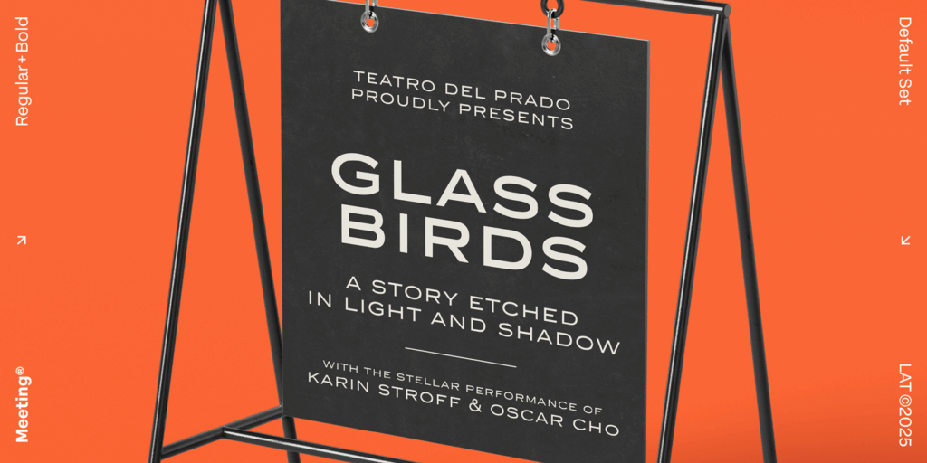
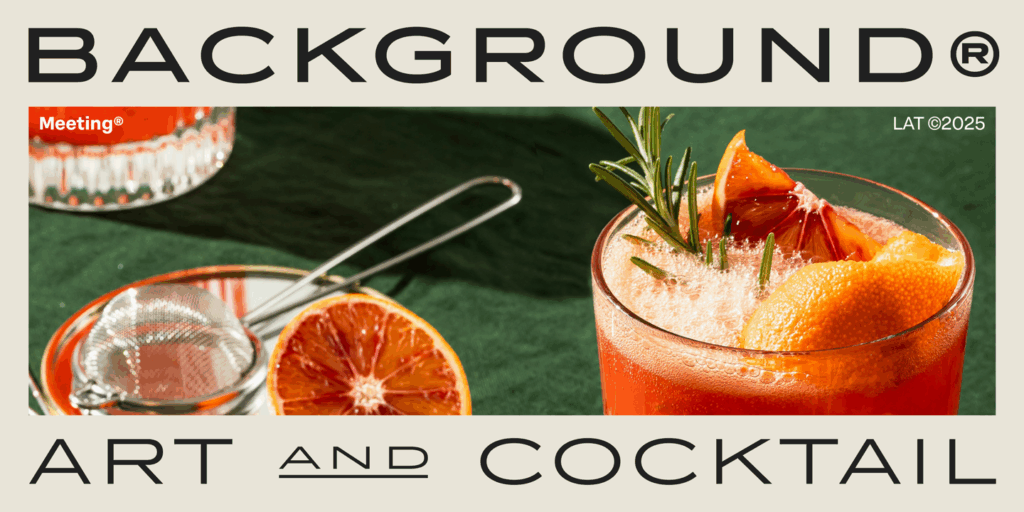
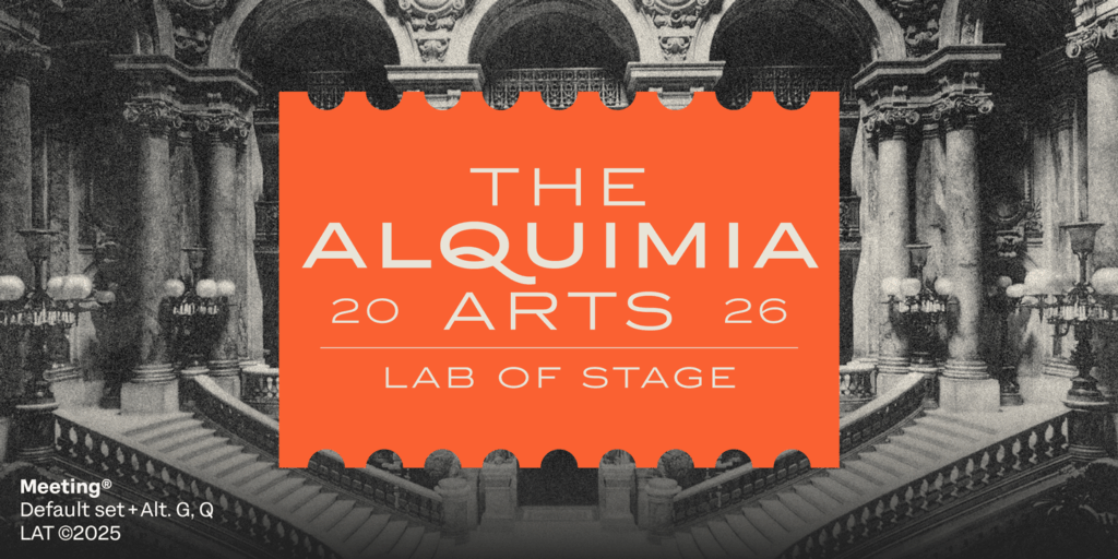
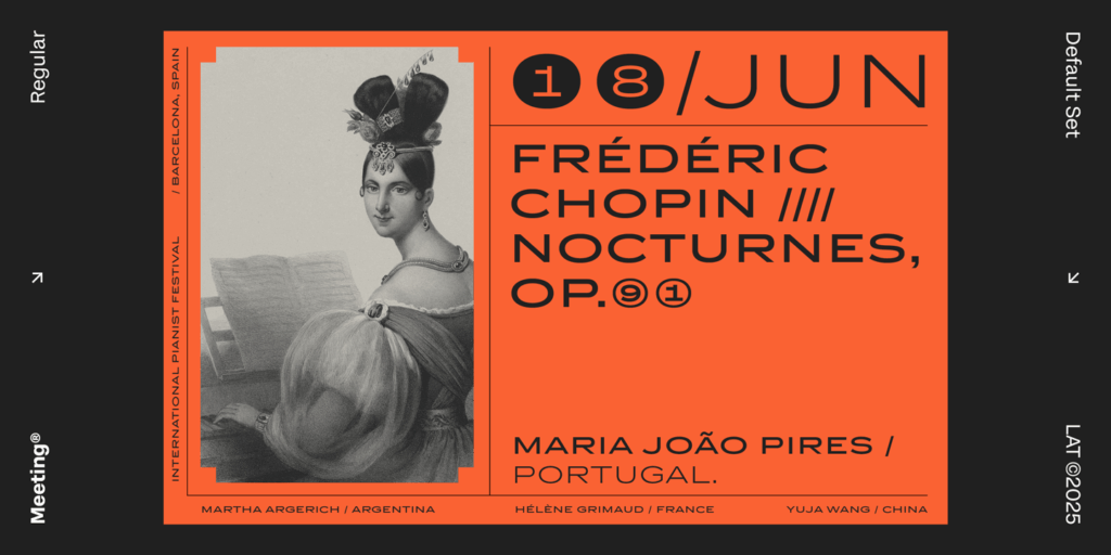
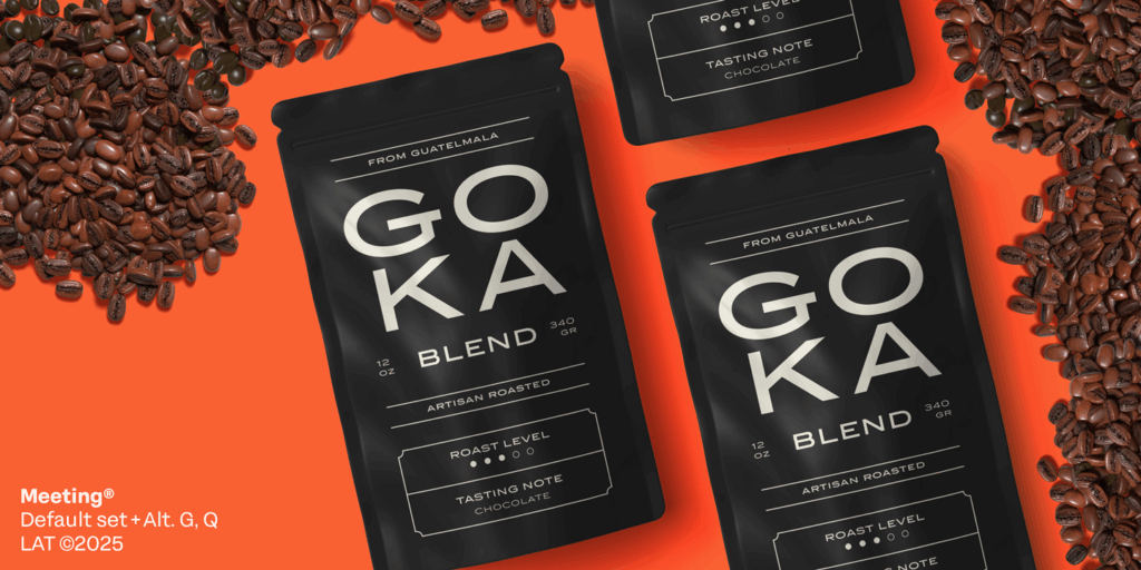
Conceived for projects with character—from cocktail or coffee labels to festival posters, menus, music, or handcrafted products—Meeting has the poise of a serious typeface with the charm of a good Negroni: balanced, bold, and with just the right touch of freshness.
