
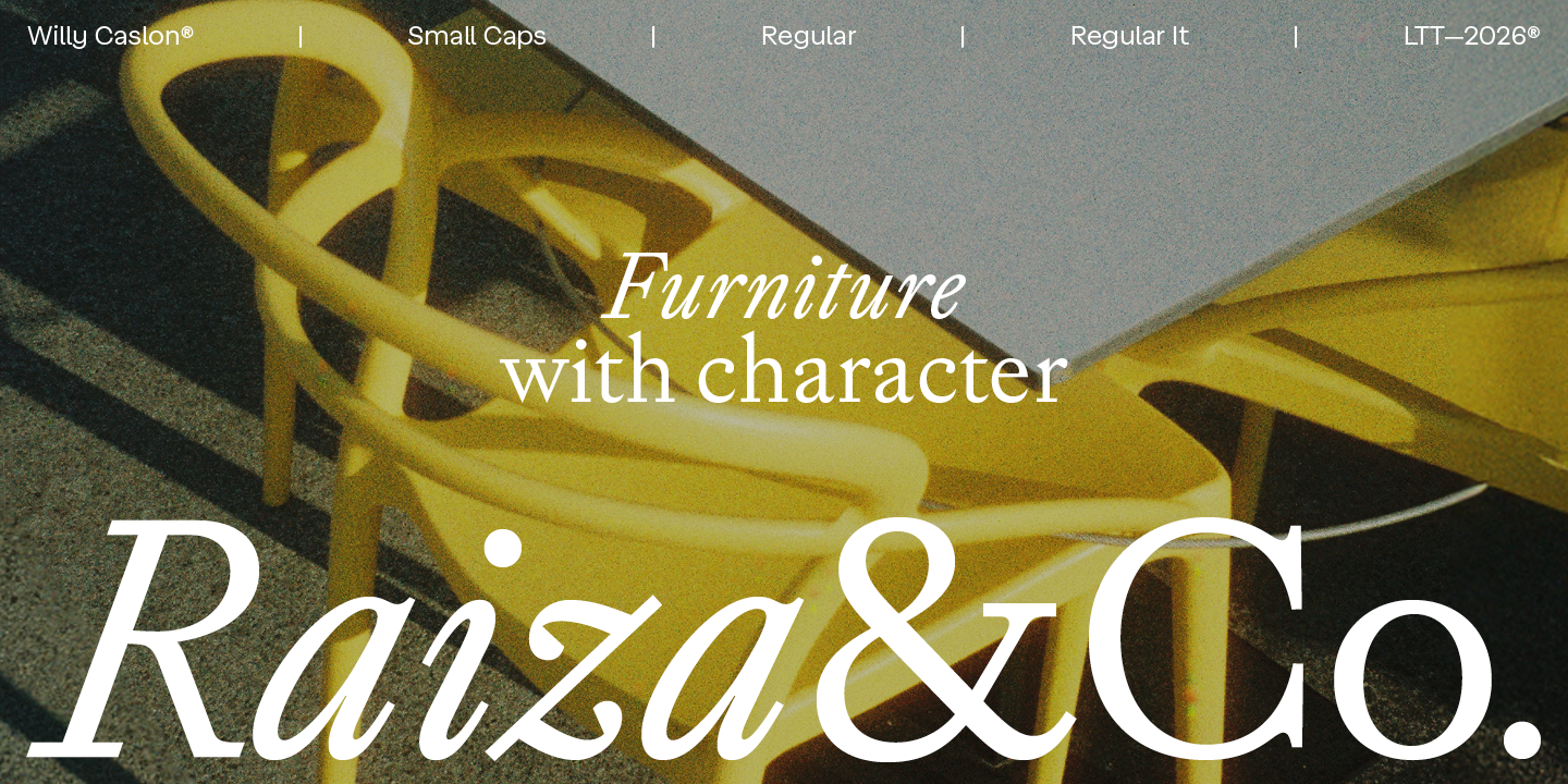
“Fresh in its stroke. Classic in its spirit.”
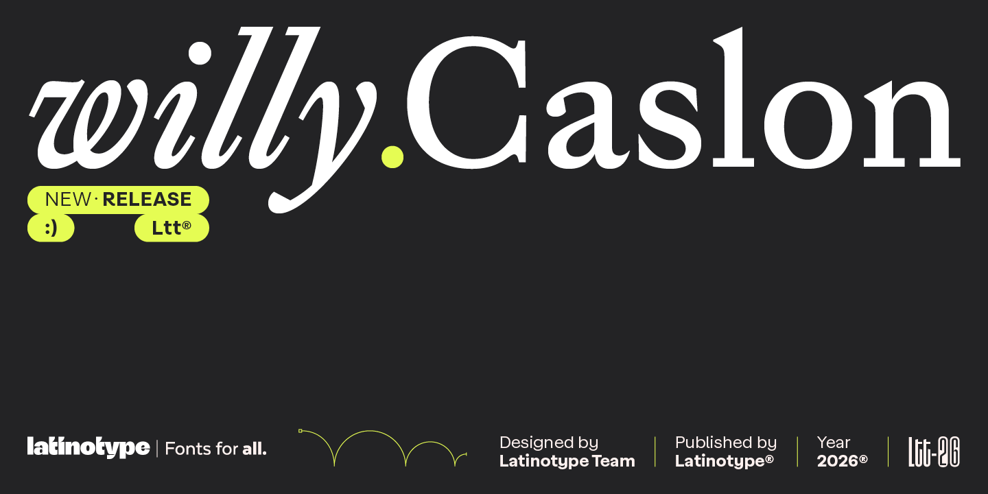
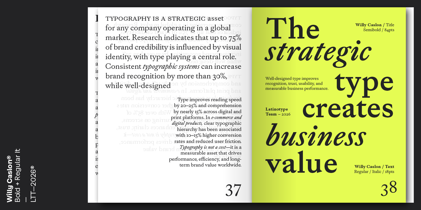
Willy Caslon is a contemporary serif typeface that reinterprets the English tradition associated with William Caslon, adapting it to modern reading rhythms. The project proposes a meeting point between the historical legacy of transitional roman typefaces and Latinotype’s editorial vision.
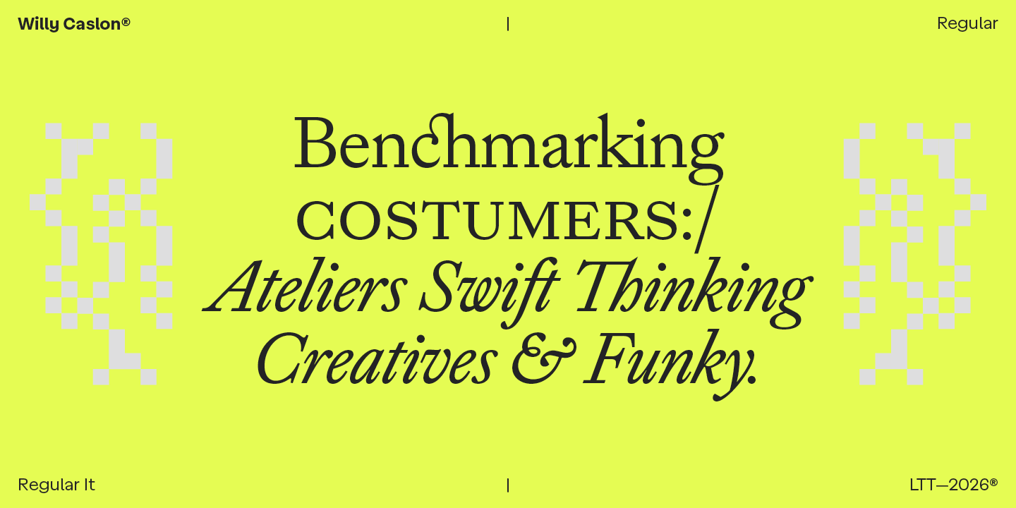
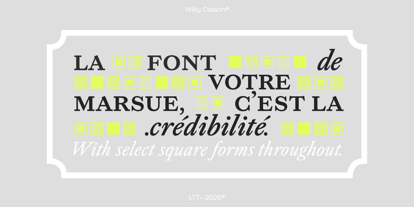
Its design begins with a moderate modulation and a slightly slanted axis, characteristic of classic Caslon, but introduces greater formal control that intensifies and revitalizes its structures. The sharp terminals are among its most recognizable features, visible in both the serifs and letters such as a, c, and r. The curves narrow and concentrate, especially in the counters of the a and g and in the shoulder of the n, generating a more active rhythm within the text.
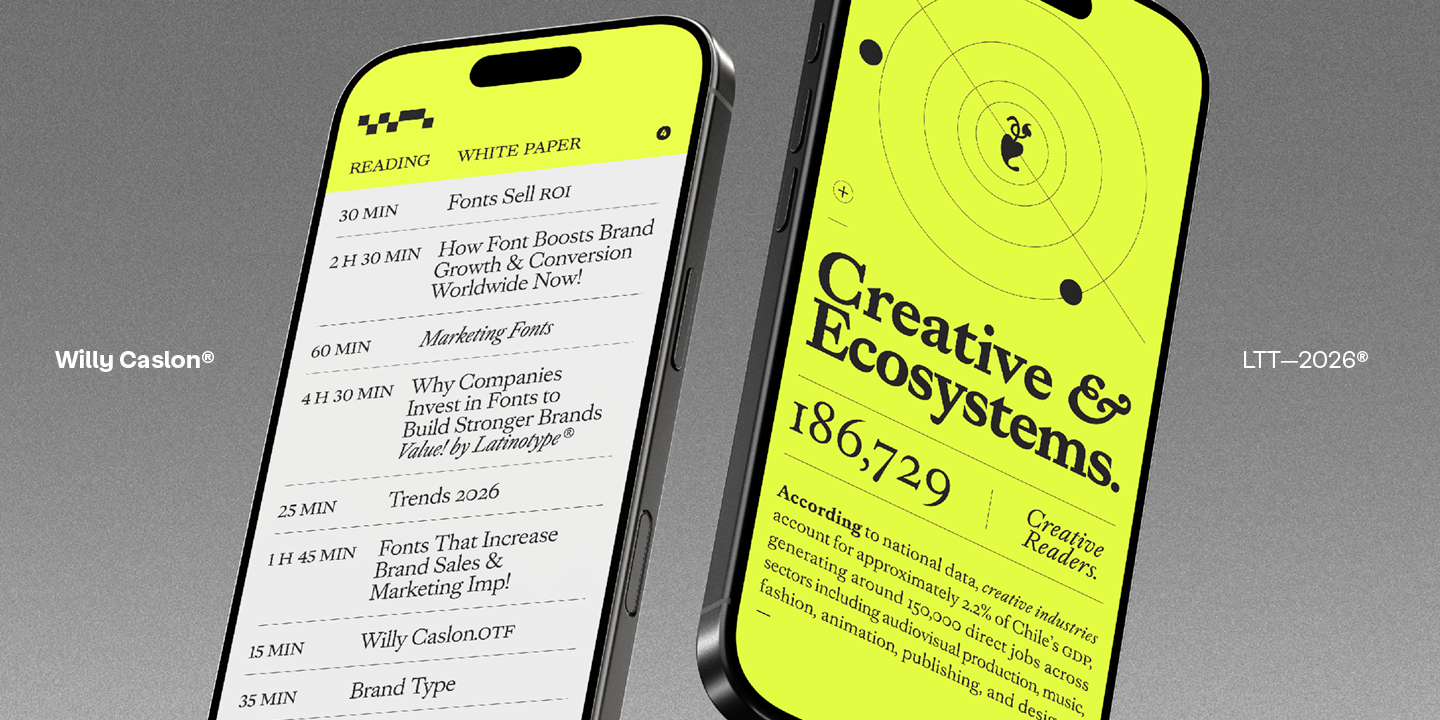
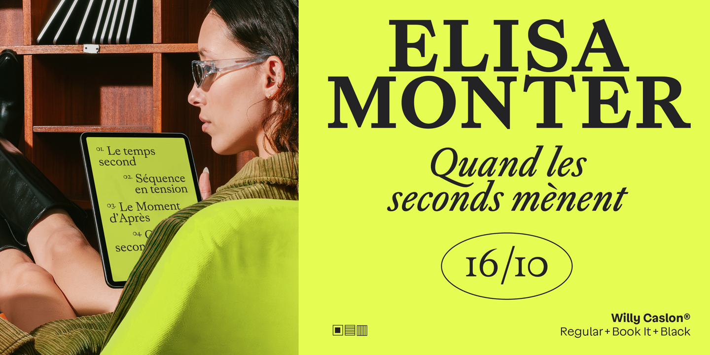
The contrast intensifies at the ends of the strokes, reinforcing the typographic presence without affecting readability. The proportions are designed for both print and digital editorial contexts, with a balanced x-height and consistent ascender-descender relationships. The italic typeface has its own construction, and the uppercase letters have been specifically designed to integrate with the system, maintaining consistency in weight and typographic color.
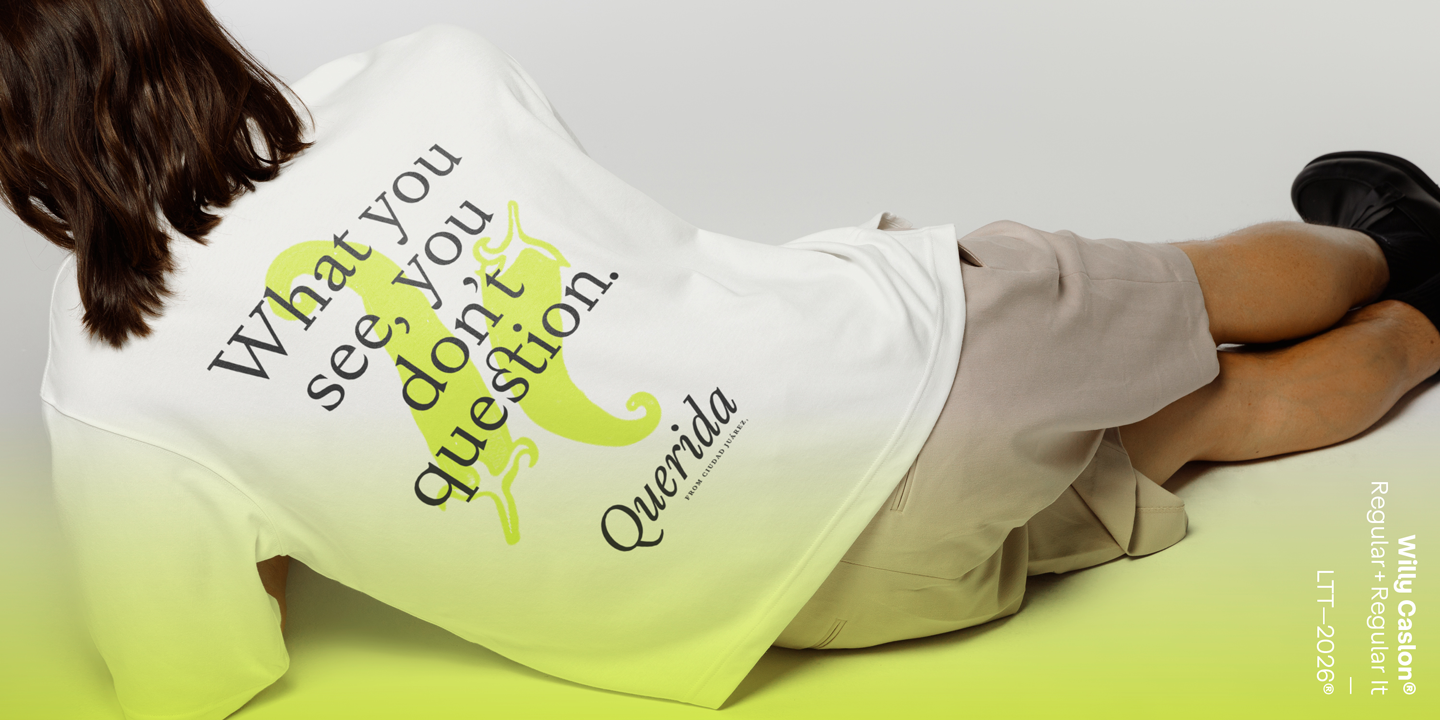
Willy Caslon retains a clear connection to Caslon’s classic spirit but translates it into contemporary use, where legibility, rhythm, and character are central criteria. It is a typeface designed for editorial identities, digital projects, and applications where a serif with typographic presence plays an active role in content development.
Fresh in its stroke. Classic in its spirit.